CSS
垂直水平居中
参考掘金
行内元素
.parent {
  width: 400px;
  height: 400px;
  text-align: center;
  line-height: 400px;
}
定位
.parent {
  width: 400px;
  height: 400px;
  position: relative;
}
.son {
  position: absolute;
  top: 50%;
  left: 50%;
  /* 未知宽高,transform */
  transform: translate(-50%, -50%);

  /* 已知宽高,margin: auto */
  width: 100px;
  height: 100px;
  top: 0;
  left: 0;
  right: 0;
  bottom: 0;
  margin: auto;

  /* 已知宽高 */
  width: 100px;
  height: 100px;
  top: 50%;
  left: 50%;
  margin-left: -50px;
  margin-top: -50px;
}
flex
- 通用
.parent {
  width: 500px;
  height: 500px;
  display: flex;
  align-items: center;
  justify-content: center;
}
- margin: auto
.parent {
  width: 500px;
  height: 500px;
  display: flex;
}

.son {
  margin: auto;
}
grid
.parent {
  width: 500px;
  height: 500px;
  display: grid;
}

.son {
  align-self: center;
  justify-self: center;
}
CSS 选择器权重
权重
- !important 无穷大
- 行内样式 style 1000
- id 选择器 0100
- 类选择器 伪类选择器 属性选择器 0010
- 标签选择器 伪元素选择器 0001
- 通配符选择器 +后 1 兄弟选择器 ~后所有兄弟选择器 0000
比较规则
- 从左往右依次进行比较 ,较大者优先级更高
- 如果相等,则继续往右移动一位进行比较
- 如果 4 位全部相等,则后面的会覆盖前面的
@layer
@layer 声明了一个 级联层,同一层内的规则将级联在一起,不属于任何一级联层的样式将被集中到同一匿名层,并置于所有层的后部
@layer 可以让 CSS 声明的优先级下降一整个级联级别
使用场景
- 覆盖第三方组件库样式
- 有些组件的 CSS reset 污染了全局
@layer 的解决方法
- 组件的 CSS 全部写入@layer 规则中,把自身的优先级降到底部
- 对于第三方的 CSS 文件,可以在传统的 @import 语法后面再添加个 layer(layer-name)
@import './lib.css' layer(lib);
flex
flex-flow是flex-direction和flex-wrap属性的简写justify-content:space-around两端有间隙,space-between两端无间隙align-items作用于纵轴单行元素,stretch值拉伸 flex 项目以填充容器(默认)align-content作用于纵轴多行元素,一行元素不起作用order规定 flex 项目的顺序,默认值是 0flex-grow属性规定某个 flex 项目相对于其余 flex 项目将增长多少,默认值是 0flex-shrink属性规定某个 flex 项目相对于其余 flex 项目将收缩多少,默认值是 0flex-basis规定 flex 项目的初始长度flex:1含义为,flex-grow: 1flex-shrink: 1flex-basix: 0%
flex 出现剩余空间或溢出空间后如何计算 flex 元素的宽度 深入理解 flex-grow、flex-shrink、flex-basis
剩余或溢出空间:x,元素的 flex-grow 或 flex-shrink:a,b,c
- 元素的扩展空间:a/(a+b+c) * x
- 元素的压缩空间:a * w1 / (a * w1 + b * w2 + c * w3) * x
justify-content 注意事项
item4 和 item5 不会和 item1、item2 在垂直方向上对其
想要实现对其,可以在后面补伪元素
<style>
  .box {
    display: flex;
    width: 400px;
    justify-content: space-around;
    flex-wrap: wrap;
  }
  .item {
    width: 110px;
    height: 100px;
    background-color: aqua;
  }
</style>
<div class="box">
  <div class="item">1</div>
  <div class="item">2</div>
  <div class="item">3</div>
  <div class="item">4</div>
  <div class="item">5</div>
</div>
Less 和 Scss 的区别
Scss 在功能上面比 Less 更强大,Less 比较的清晰明了,容易上手
语法上的区别
- 声明和使用变量:Less 用@符号,Scss 用$符号表示
- Scss 支持条件语句,Less 不支持
- Mixins
@mixin theme($theme: DarkGray) {
  background: $theme;
  box-shadow: 0 0 1px rgba($theme, 0.25);
  color: #fff;
}

.info {
  @include theme;
}
.bordered {
  border-top: dotted 1px black;
  border-bottom: solid 2px black;
}

#menu a {
  color: #111;
  .bordered();
}

.post a {
  color: red;
  .bordered();
}
Sass 与 Scss
-
Scss 是 Sass 3 引入新的语法,是 Sassy CSS 的简写,其语法完全兼容 CSS3,并且继承了 Sass 的强大功能
-
Sass 是以“.sass”后缀为扩展名,而 Scss 是以“.scss”后缀为扩展名。
-
Sass 是以严格的缩进式语法规则来书写,SCSS 需要使用分号和花括号,与 CSS 语法类似
实体编码
参考 山月
HTML 实体是一段以连字号(&)开头、以分号(;)结尾的字符串,用以显示不可见字符及保留字符
比如:
- 不可分的空格:&nbsp;
- (小于符号):&lt;
- (大于符号):&gt;
css 中哪些常见的布局方式
流式布局(Flow Layout)、浮动布局(Float Layout)、定位布局(Positioning Layout)、弹性盒子布局(Flexbox Layout)、网格布局(Grid Layout)
margin 值为负数
CSS 放在顶部,JS 放在底部
CSS 不会阻塞 DOM 的解析,可以和 DOM 一起解析,但会阻塞 DOM 的渲染
JS 放在底部:
- 让浏览器更快地加载和解析 HTML 和 CSS,从而加速页面的加载速度
- 避免 JavaScript 执行错误,因为 JS 可能会获取 DOM 信息
width 值为百分数
相对于父元素 content 的宽度
inline
- inline 元素设置 width、height 属性无效
- inline 元素的 margin 和 padding 属性,水平方向产生效果,垂直方向无效果
- vertical-align 用来指定行内元素(inline)或表格单元格(table-cell)元素的垂直对齐方式
定位
同时设置 left 和 right 时,left 生效,right 不生效,同样 top 和 bottom,top 生效
top 参考点
参考 clientWidth 与 clientHeight 围起来的区域
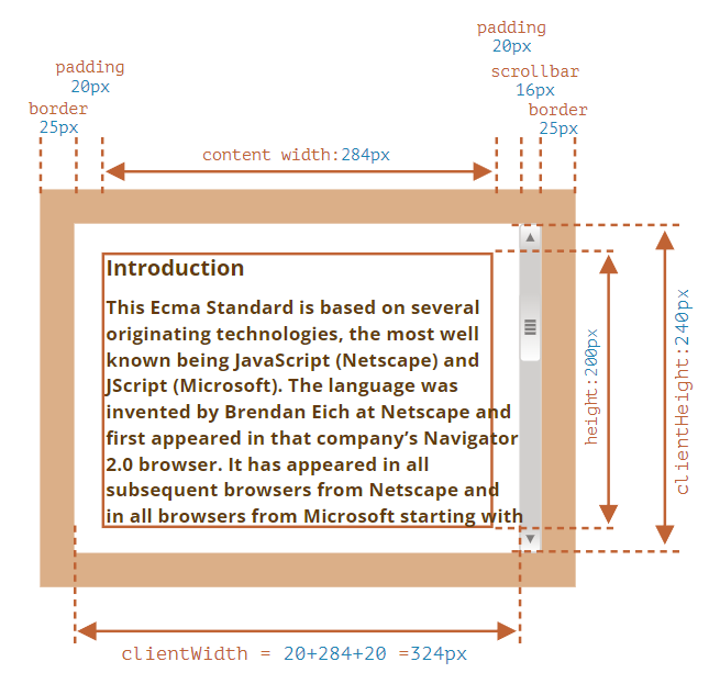
图片来源 现代 JavaScript 教程
CSS 继承属性
特殊
- a 标签的字体颜色不能继承自父元素
- h1-h6 标签字体的大小也是不能继承自父元素
- 字体系列属性
font:组合字体
font-family:规定元素的字体系列
font-weight:设置字体的粗细
font-size:设置字体的尺寸
font-style:定义字体的风格
font-variant:偏大或偏小的字体
- 文本系列属性
text-indent:文本缩进
text-align:文本水平对刘
line-height:行高
word-spacing:增加或减少单词间的空白
letter-spacing:增加或减少字符间的空白
text-transform:控制文本大小写
direction:规定文本的书写方向
color:文本颜色
- 元素可见性
visibility
- 表格布局属性
caption-side:定位表格标题位置
border-collapse:合并表格边框
border-spacing:设置相邻单元格的边框间的距离
empty-cells:单元格的边框的出现与消失
table-layout:表格的宽度由什么决定
- 列表属性
list-style-type:文字前面的小点点样式
list-style-position:小点点位置
list-style:以上的属性可通过这属性集合
- 引用
quotes:设置嵌套引用的引号类型
- 光标属性
cursor:箭头可以变成需要的形状
CSS 实现三角形
- border
box-sizing 为 content-box,宽高都设置成 0,则 div 只与 border 有关
box-sizing 为 border-box,设置每个边的宽度
实现一个上三角形示例
.triangle {
  width: 0;
  height: 0;
  border-top: 50px solid skyblue;
  border-right: 50px solid transparent;
  border-left: 50px solid transparent;
}
实现一个等边三角形
.triangle {
  width: 0;
  height: 0;
  border-left: 69px solid transparent;
  border-right: 69px solid transparent;
  border-bottom: 120px solid skyblue;
}
- linear-gradient
缺点: 需要手动调试渐变角度
.triangle {
  width: 160px;
  height: 200px;
  outline: 2px solid skyblue;
  background-repeat: no-repeat;
  background-image: linear-gradient(
      32deg,
      orangered 50%,
      rgba(255, 255, 255, 0) 50%
    ), linear-gradient(148deg, orangered 50%, rgba(255, 255, 255, 0) 50%);
  background-size: 100% 50%;
  background-position:
    top left,
    bottom left;
}
- clip-path
缺点: 浏览器兼容不好
clip-path 就是使用它来绘制多边形(或圆形、椭圆形等)并将其定位在元素内。实际上,浏览器不会绘制 clip-path 之外的任何区域,因此我们看到的是 clip-path 的边界。
.triangle {
  margin: 100px;
  width: 160px;
  height: 200px;
  background-color: skyblue;
  // top-left (0 0)、bottom-left (0% 100%)、right-center (100% 50%)
  clip-path: polygon(0 0, 0% 100%, 100% 50%);
}
常见 CSS 解决方案
- 手动控制模块化:比如在一个组件的最外层容器中定义一个类名,在组件内部的 css 选择器都加上该类名
- CSS Module:通过给每个 css 类名加上 hash 后缀的方式,让CSS类名局部化
- 原子化 CSS:预先定义一系列 css 工具类,通过组合这些工具类的方式,描述样式
- CSS in JS:将 CSS 样式直接嵌入 JavaScript 组件中的技术,动态修改更加灵活